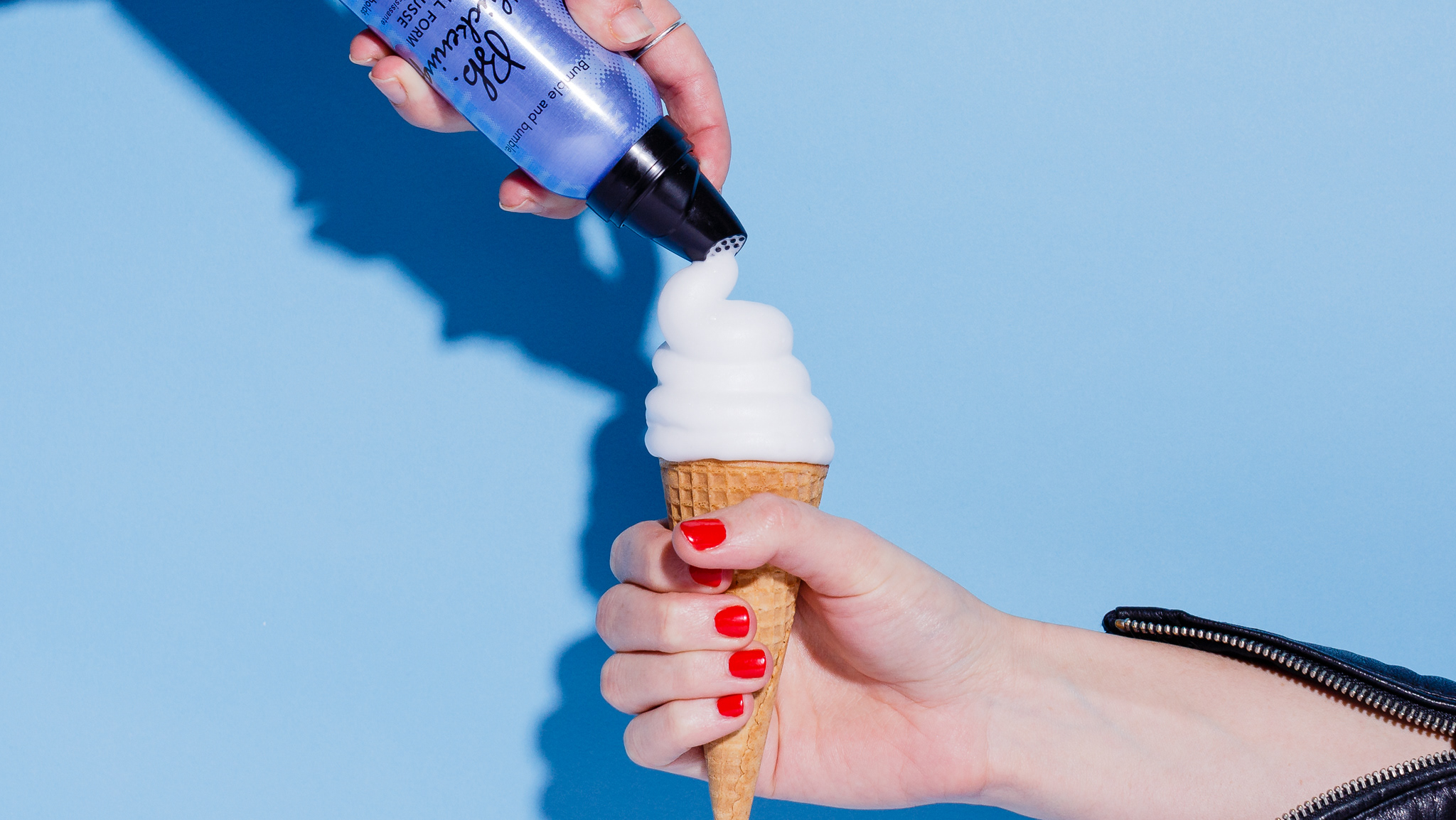
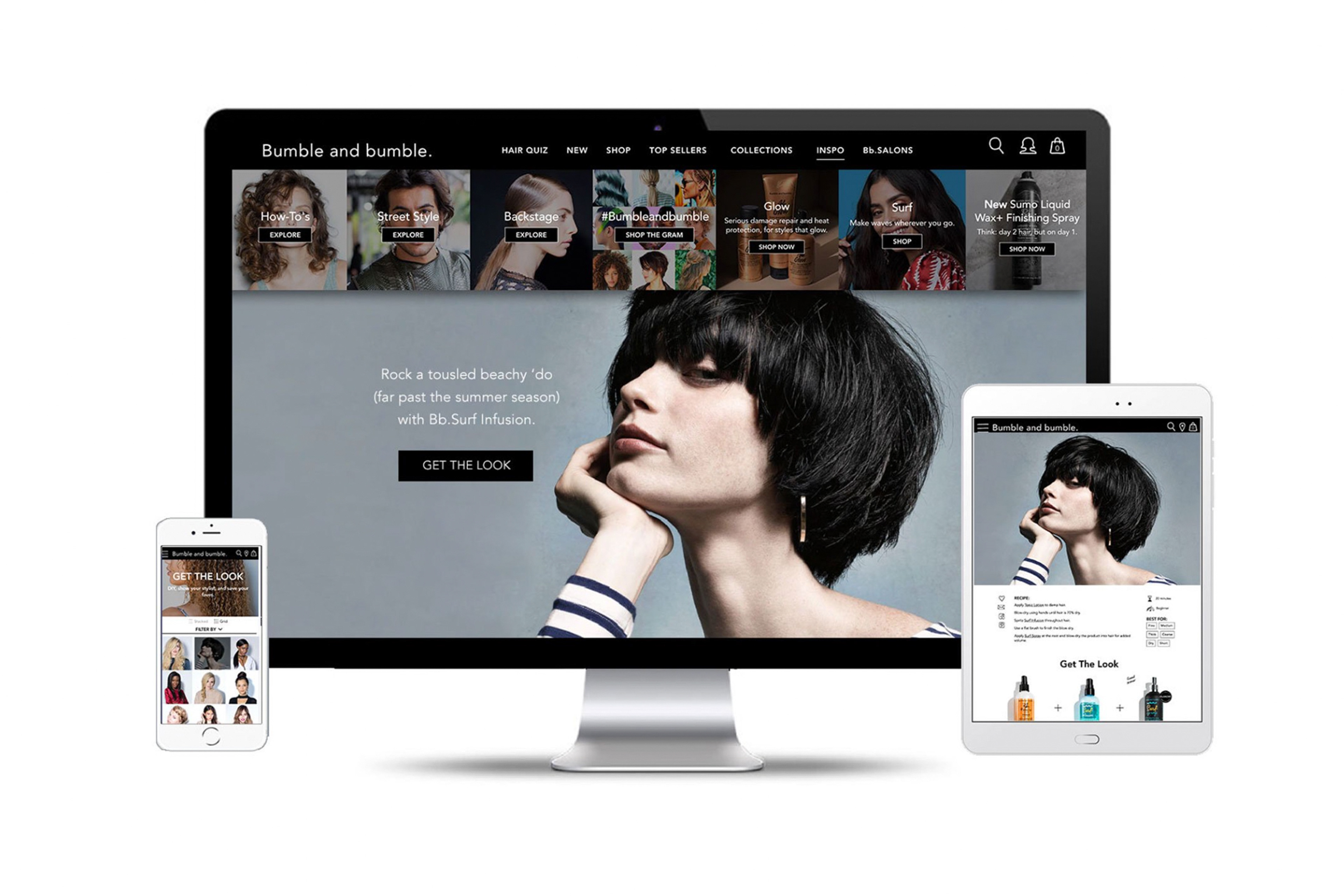
Bumble and bumble.
Bumble and bumble’s website redesign was born from the need for the cult leading brand to modernize digitally. Goals included: functionality to support commerce and dynamic content, a custom CMS for ease of maintenance, a new style guide, and optimal UX for modern devices. After launch, sales have increased by 15% and engagement has doubled.
New features of the redesign include: responsive design, integrated blog with content and commerce, interactive style guides, a new lookbook, shoppable UGC integration, and new product photography.
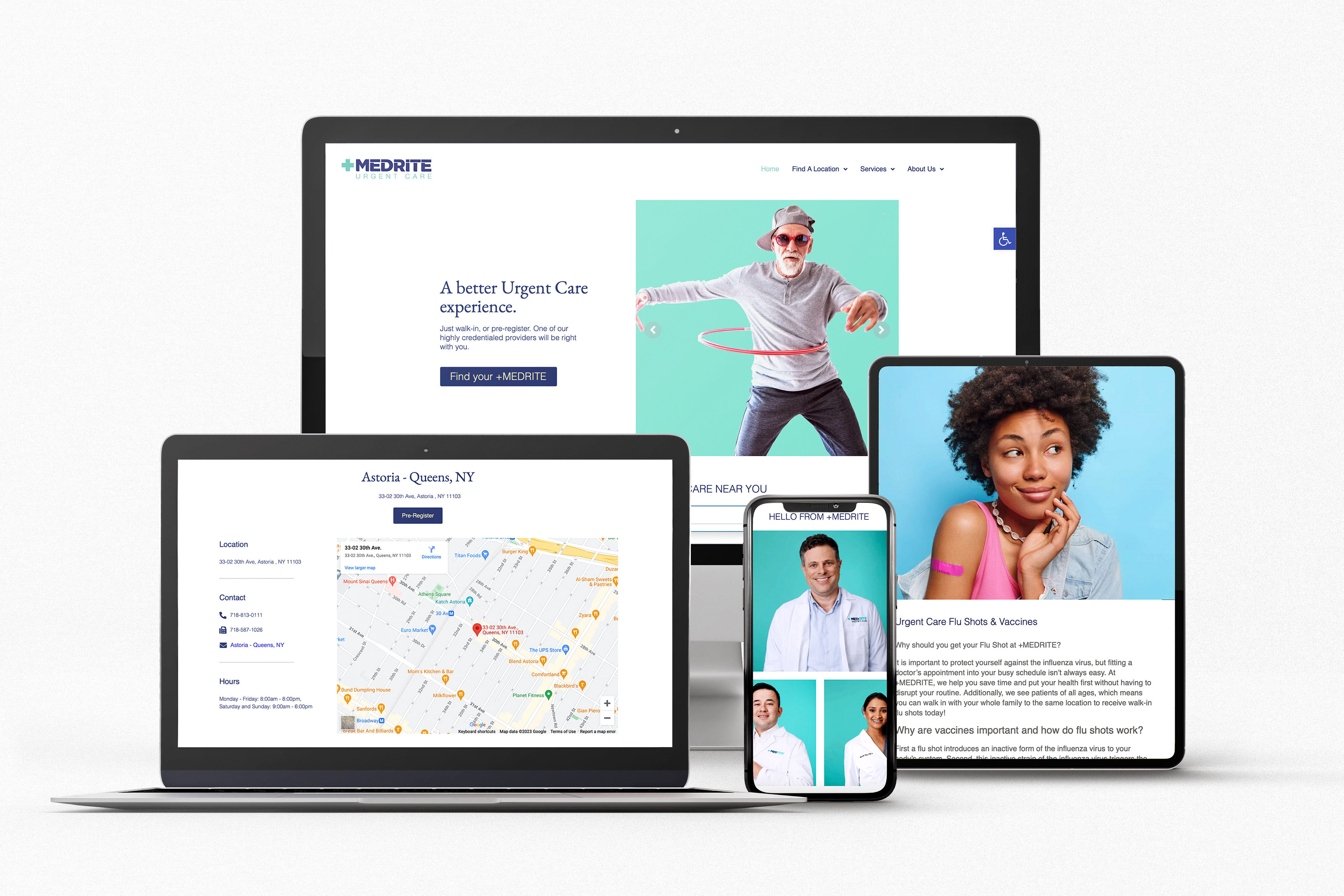
Medrite Urgent Care
A great user experience on an urgent care website would prioritize the needs and goals of the user, making it easy for them to find the information they need quickly and efficiently
Overall, a great user experience on an urgent care website would prioritize ease of use, clarity, and efficiency, making it easy for users to find the information they need quickly and take the necessary actions to get the care they need.
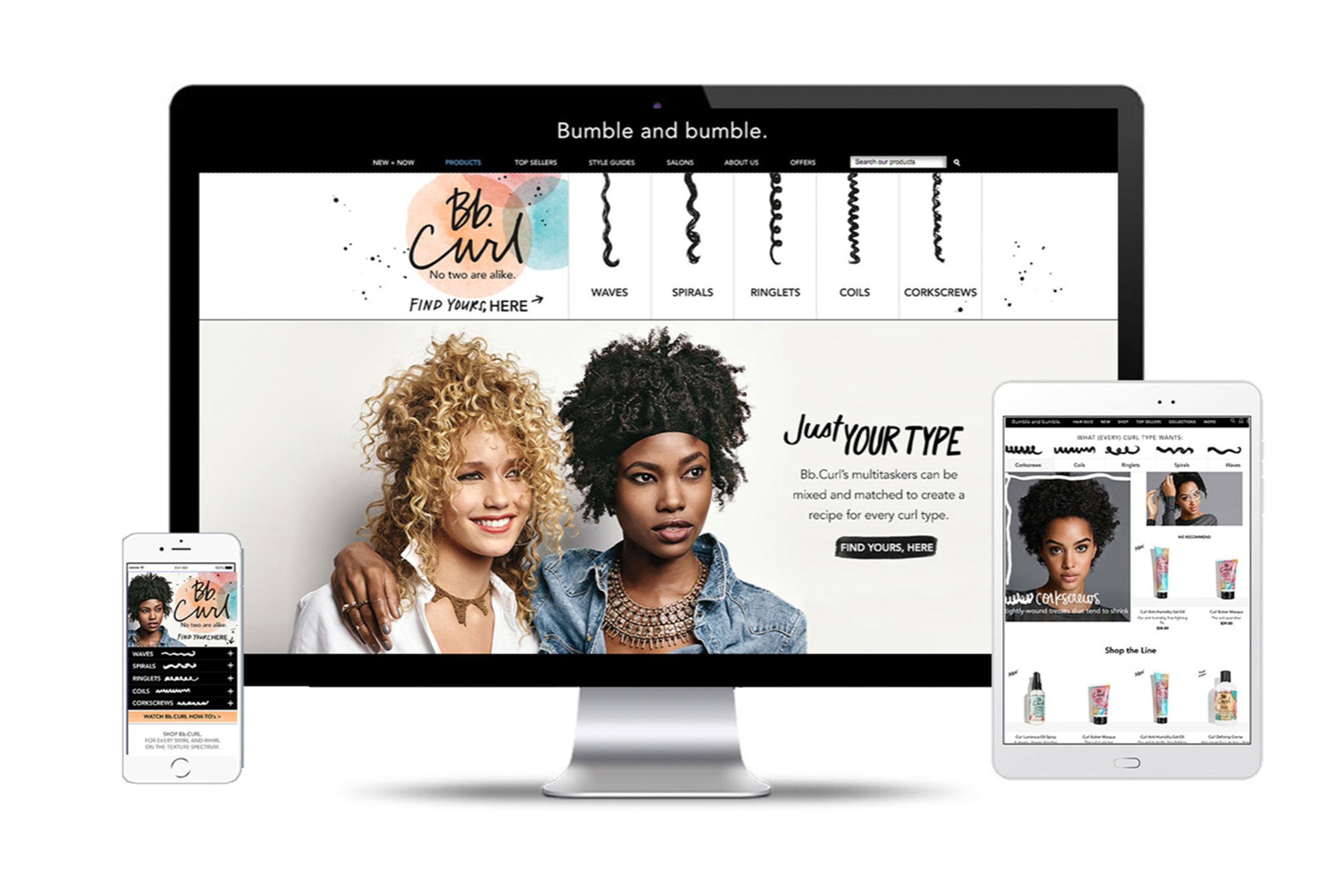
Curl Conscious Mini Site
The Bumble and bumble lookbook was a historically ‘screengrabbed’ (and sometimes printed..) resource handed to salon stylists for cuts, color, and updos. With the redesign, we wanted to keep the mecca of inspiration, and double down on looks, features, and UX—providing more content, recipes, product recommendations and filters to quickly find relevant looks (in the stylist’s chair or at home). The interface was designed based on consumer trends and behavior, taking notes from instagram’s interface viewing options of grid or stacked content, with ease to send, save, or show your stylist with a quick tap.
The Bumble and bumble lookbook was a Webby 2018 Honoree for best visual design and function.
IInteractive and educational guides assist consumer in finding relevant product, content, and inspiration.
L2 acknowledged the interactive Bb.Curl finder as ‘best-in class’ one-click diagnostic
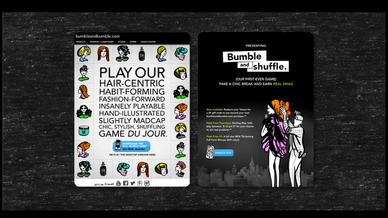
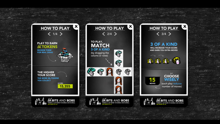
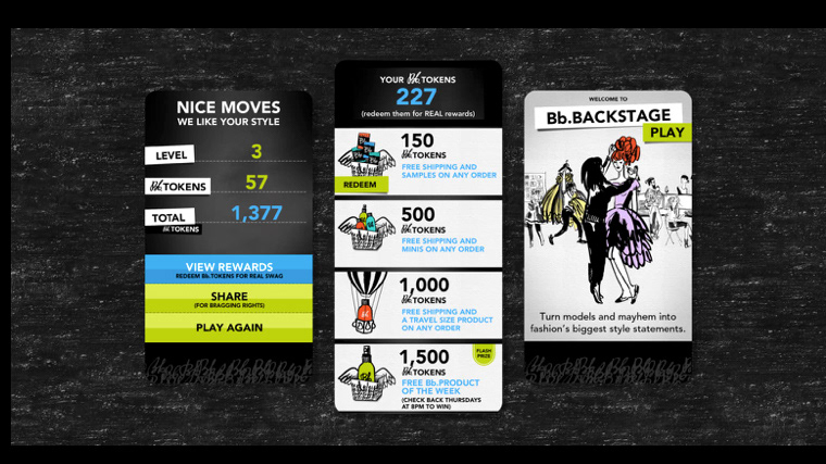
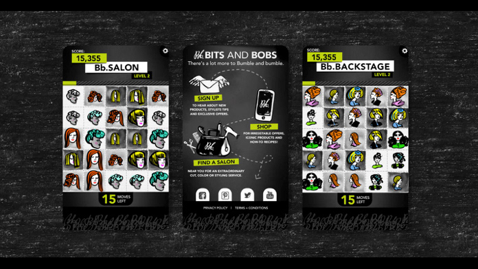
Game Design